Thomas Adorff - What is printed remains

Thomas Adorff is well known for his lectures at numerous photo festivals or his workshops in his studio in Karlsruhe. For the past six months, he has been using the EIZO ColorEdge CS2740 as the optical centrepiece of his digital darkroom. Here he describes his experience with the new 4K graphics monitor from EIZO and gives tips for printing on the inkjet printer at home.
Adorff believes the photographic-creative process does not end with the shooting and subsequent image processing, it is only complete when he can hold his image in his hands in print.
"At the beginning of my photographic career, I was still frolicking in the analogue darkroom", Adorf reports and adds: "That wasn't professional, but I'm glad I was still able to experience that era. It made me appreciate the haptic dimension of photography. Nowadays, you don't have to sit in a dark room and handle chemicals if you want to hold your picture in your hands. But there are a few things you have to consider so the print looks exactly as the photographer hoped it would“.
It is precisely these basics Adorff regularly teaches in his workshops. “This ‘aha‘ moment when the workshop participants hold their picture in their hands for the first time and feel how the depicted motif merges with the properties of the paper and the haptic experience to form the overall work is fascinating every time," states Adorff. You can't compare this with a pure image file on a website.
Prerequisite: Monitor
Many participants in Adorff's printing workshops have already printed images themselves and complain about differences between the monitor image and the print. Adorff explains, "if there are discrepancies here, there can be several causes; an unsuitable, incorrectly adjusted or uncalibrated monitor is the most common cause. If I get a distorted view of the image file from the monitor, I cannot expect this file to print in the same way as the distorted mirage image. In addition, the monitor, computer, and image processing software must be matched and adjusted to each other. Consistent colour management is indispensable“.
ColorEdge CS2740 from EIZO
Adorff runs EIZO's ColorEdge CS2740 - a 27-inch wide-gamut monitor with 4K resolution - on his iMac. "I really enjoy working on the CS2740", expresses Adorff. "This is partly because working on the CS2740 is pleasant even after many hours. In addition, it is crisp thanks to the 4K resolution. However, the biggest 'relaxation factor' is I no longer worry about the technical side of the workflow, but simply know what I see corresponds to my image file". In addition, Adorff regularly calibrates his monitor with his X-Rite i1 Studio, but even out-of-the-box the monitor was perfectly pre-calibrated, as Adorff enthusiastically reports: "The homogeneity is impeccable, the colour space is huge, and gradients are displayed absolutely smoothly and without transitions".

Influence factor paper
But even if you use a perfectly calibrated graphics monitor like the ColorEdge CS2740, there is still one crucial step missing to be able to judge the finished printout on the monitor: the soft proof view. One and the same image file looks completely different on different papers. While an image on a glossy paper looks very similar to the monitor display, an image on a matte material with a strong surface structure usually has less contrast and the colours are also less vivid. This is not a fault. In fact, it is precisely these peculiarities which are the reason why different materials are used. Where does that come from? You cannot apply more than 100 per cent black ink to a matt paper and still the result appears only dark grey. And if the paper itself has a slightly warm tint, for example, you cannot expect pure white areas on it, because the printer cannot do more than not print on white areas. The maximum achievable white in the printout corresponds to the colour tone of the paper. These properties cannot be changed on the computer. However, they can be simulated on the screen and the image can be optimised immediately. To do this you need an ICC profile, and you can measure this yourself with the help of a spectrophotometer. You can simply download the profiles for the common fine art printers from the printer or paper manufacturers.
Soft proof view on the monitor
Thanks to an absolutely precise monitor like the ColorEdge CS2740, Adorff can simulate the properties of the different papers in the soft proof view of Photoshop and Lightroom on the monitor and optimise the image files with regard to the individual properties of the different papers. "The soft proof view is particularly helpful for all non-glossy papers without optical brighteners, as these papers have a relatively large effect on the appearance of the printout", explains Adorff, who prefers to use papers from Ilford and Tecco. “Many workshop participants experienced this problem and complained the print looks different afterwards than desired or expected, this is mostly because an unsuitably calibrated monitor was used, and that the soft proof view was not used". An image simply looks different on a matt, highly textured paper than on high-gloss paper.
Factor viewing conditions
Another factor causing discrepancies between the monitor display (with soft proof view enabled) and the print is the viewing conditions and the calibration target to which the monitor has been calibrated. If both do not match, the monitor display and the print will look very different to the viewer, even if they are technically the same. Therefore, not only is it important the monitor is calibrated, especially in brightness and white point, to the conditions prevailing at the image processing location but the print is then viewed with suitable lighting. Otherwise, a meaningful assessment of the print is not possible.

What is printed remains
But why print at all? Adorff has several answers: firstly, the interplay of motif and printer paper creates an independent piece of work. Moreover, it is important to consider which paper is most appropriate and how the picture will be presented or hung up afterwards. "For me, it has a lot to do with the appreciation I have for my pictures", Adorff explains; "what gets printed stays. It makes a huge difference to me whether I store an image as a file on a hard drive or show it small on a website or print it out and hang it on the wall".
Creating unique pieces with liquid emulsion
Adorff likes to go one step further and print his very own, individual materials. To do this, he uses Ilford's liquid emulsion, which can be used to make materials not made for inkjet printing printable. The emulsion is available in transparent and white, meaning the variety of printable media can be expanded almost infinitely. "What I find particularly appealing is I can create completely individual one-offs", explains Adorff. "It's a way to bring back some of the uniqueness which has been lost in the infinite digital reproducibility". The possibilities of digital photo printing are almost inexhaustible and new materials regularly appear on the market to give images the value they deserve. Because one thing is certain: too much effort, too much heart, and soul have gone into them to bury them on a hard drive.

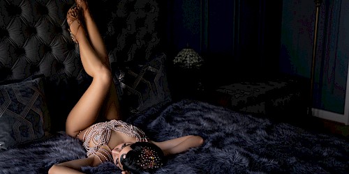
A selection of his works


More from the site
EIZO Interviews Tigz Rice
Tigz Rice – Professional Empowerment Photographer